Compose / six finishing passes
One image.
Six different passes.
Compare each effect on the same photograph, learn what its controls change, then try the exact settings yourself. Combine these passes with the shapes and movement you make in FLOW, TRACE or DUEL.
01 / Compose
Tone & color
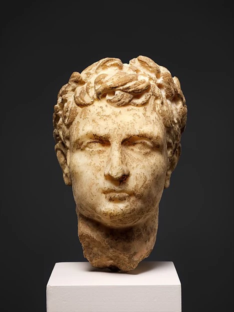
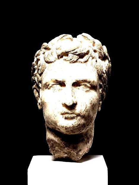
Set the exposure, contrast and saturation before the other passes. A small change here changes the shapes that later thresholds and print dots will see.
Controls. Exposure shifts brightness. Contrast separates light and dark. Saturation controls color intensity.
| Control | Range | What changes |
|---|---|---|
| Exposure | −2 to 2 | Shift the whole image darker or lighter. |
| Contrast | −1 to 1 | Compress or separate the tones. |
| Saturation | 0 to 2 | 0 is monochrome; 1 preserves color intensity. |
| Mix | 0 to 1 | 0 leaves the image unchanged; 1 applies the full effect. |
Try it. Turn saturation down before adding two inks. Push contrast before Print dots for a harder print.
Shown at 100% mix · Exposure 0.35 · Contrast 0.45 · Saturation 0.35×
02 / Compose
Two inks
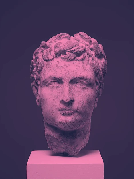
Map dark and light to two chosen colors. Intermediate tones become a continuous blend between those inks.
Controls. Shadow and Highlight set the color pair. Mix brings some of the original colors back.
| Control | Range | What changes |
|---|---|---|
| Shadow ink | Color | The ink assigned to the darkest pixels. |
| Light ink | Color | The ink assigned to the lightest pixels. |
| Mix | 0 to 1 | 0 leaves the image unchanged; 1 applies the full effect. |
Try it. Use a dark purple and a pale warm ink, then reverse their brightness for a negative-like result.
Shown at 100% mix · Shadow ink #181e3c · Light ink #ff8bb9
03 / Compose
Color steps
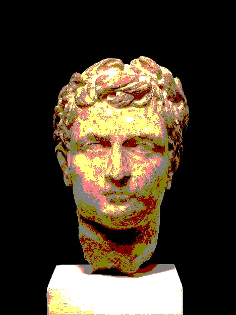
Reduce continuous color to visible steps. Fine photographic shading becomes broad graphic bands.
Controls. Levels sets how many steps each color channel can use. Mix softens the jump between levels.
| Control | Range | What changes |
|---|---|---|
| Color levels | 2 to 12 | The number of levels per color channel, not a total palette count. |
| Mix | 0 to 1 | 0 leaves the image unchanged; 1 applies the full effect. |
Try it. Try three or four levels, then move this pass before Tone & color to compare the order.
Shown at 100% mix · 3 levels per color channel
04 / Compose
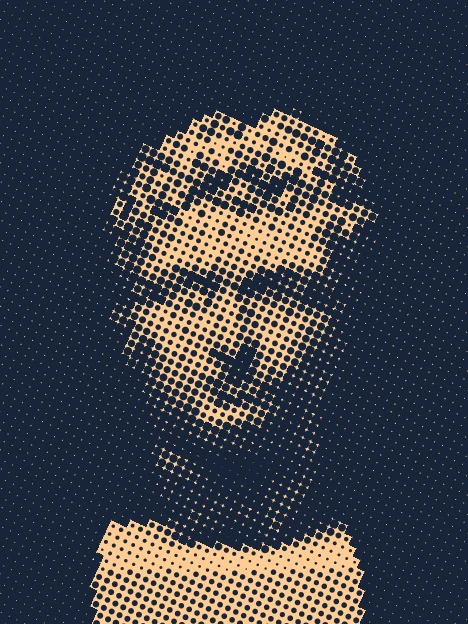
Print dots
Replace tones with a regular field of ink dots. Dot size carries the brightness of the image.
Controls. Cells changes the grid density. Angle rotates it. Ink and Paper choose the two print colors.
| Control | Range | What changes |
|---|---|---|
| Dot density | 8 to 240 | More cells produce a finer screen. |
| Screen angle | −90° to 90° | Rotate the dot grid. |
| Dot ink / Paper | Colors | Choose the dot and background colors. |
| Mix | 0 to 1 | 0 leaves the image unchanged; 1 applies the full effect. |
Try it. Use fewer cells for a coarse poster. Raise contrast first if the subject is disappearing into midtones.
Shown at 100% mix · Dot density 54 cells across the longer side · Screen angle 25° · Dot ink #172538 · Paper #ffcc92
05 / Compose
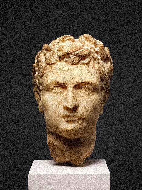
Film grain
Add a repeatable fine grain over the image. It breaks up flat surfaces without changing the image geometry.
Controls. Amount sets the strength. Coloured grain changes channels separately. The saved seed keeps the same texture.
| Control | Range | What changes |
|---|---|---|
| Grain | 0 to 1 | The amount of noise in the finish. |
| Colored grain | On / off | Use independent color-channel noise instead of neutral grain. |
| Mix | 0 to 1 | 0 leaves the image unchanged; 1 applies the full effect. |
Try it. Put grain after Two inks for texture that sits on top of the ink. Lower Mix when exporting small images.
Shown at 100% mix · Grain 50% · Neutral grain
06 / Compose
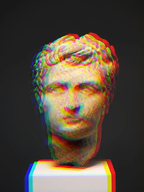
Color offset
Separate color channels horizontally and vertically. High-contrast edges become a split-color fringe.
Controls. Horizontal and vertical offsets are fractions of the image size. Mix controls how much separation remains.
| Control | Range | What changes |
|---|---|---|
| Horizontal offset | −0.04 to 0.04 | Channel shift as a fraction of image width. |
| Vertical offset | −0.04 to 0.04 | Channel shift as a fraction of image height. |
| Mix | 0 to 1 | 0 leaves the image unchanged; 1 applies the full effect. |
Try it. Start with a small horizontal offset. Put this after Color steps for crisp, broken color edges.
Shown at 100% mix · Horizontal shift 2.8% of width · Vertical shift -1.2% of height
A worked combination
Same passes. Different order.
Three passes, the same source and the same values as above. Only the last two positions change. Open either stack and use the up / down buttons in Compose to compare it yourself.
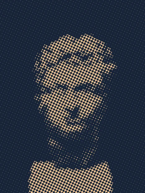
Tone & color → Two inks → Print dots. The last pass sets the paper and dot colors.
Try this exact stack ↗
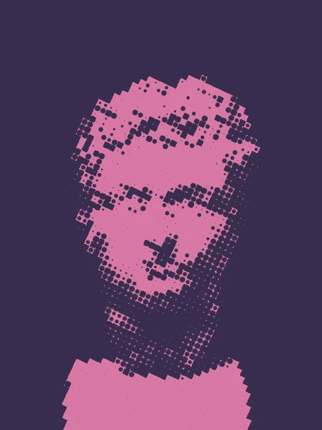
Tone & color → Print dots → Two inks. The last ink mapping now recolors the dot pattern itself.
Try this exact stack ↗
Order is part of the effect.
Compose lets you reorder passes, turn them off, change their mix and lock individual passes before randomising. Save a version before experimenting. PNG and animation include this finish; editable SVG and cutting files preserve the underlying shapes and inks.