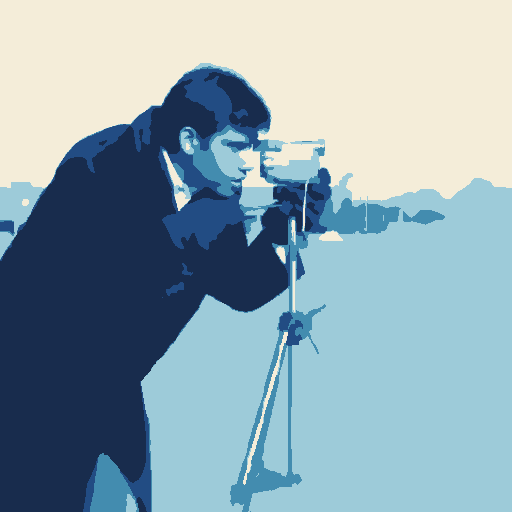
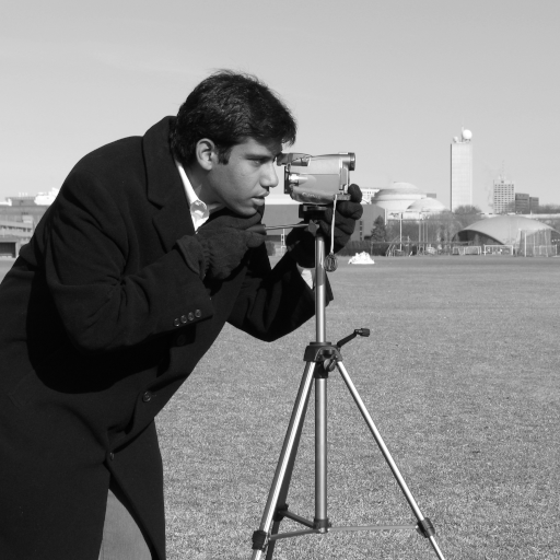
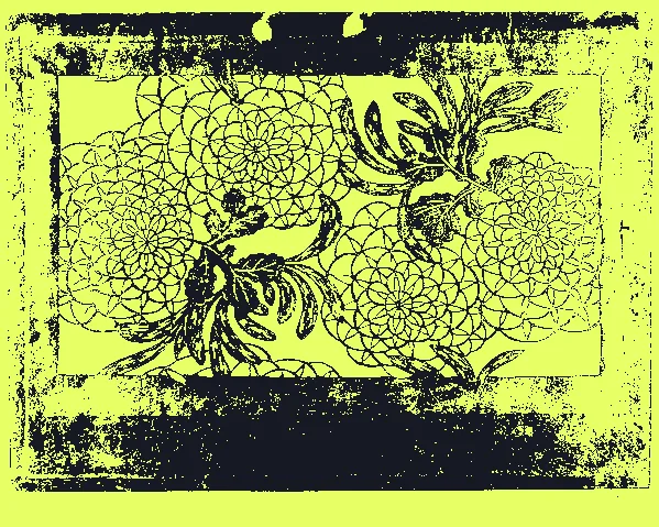
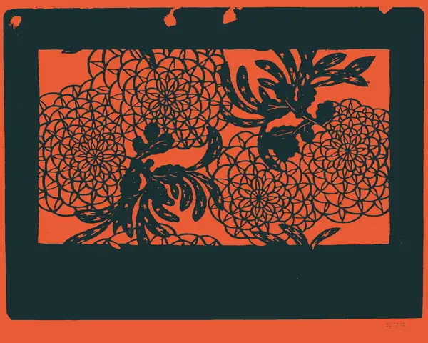
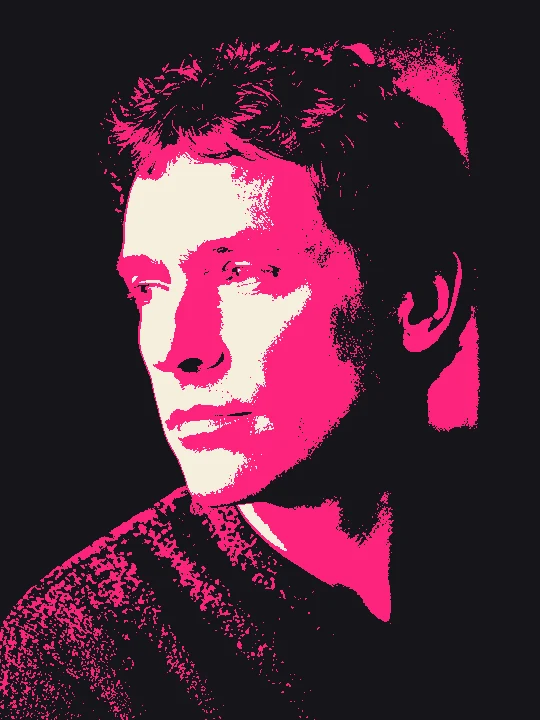
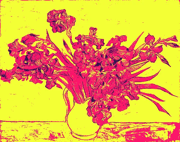
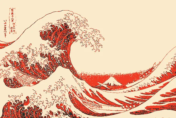
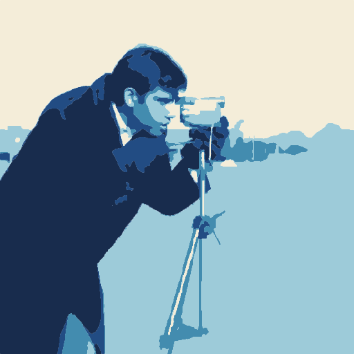
Focal priority keeps the person and camera legible while the background is grouped into broader masses. Five fitted tonal bands preserve the lighting; Solid inks exposes the same geometry delivered in SVG.
Make a decision. Look at the camera silhouette, face and jacket. Keep the lowest detail that preserves them; lower background detail when distant texture competes. A focal region guides simplification, it does not cut out a semantic subject.
Try it. Open Start → Tonal print. Place the focal area around the person and camera; compare Quiet background and Detail before applying. Applying Start is one undoable edit; compare the preview before applying, then keep a version in History.
For your own image, open Start → Load style and choose the downloaded file. Refit the focal area or crops, compare the preview and apply. The example uses an unmarked Pro output; the same creative controls are free.
Carry the direction to another image.
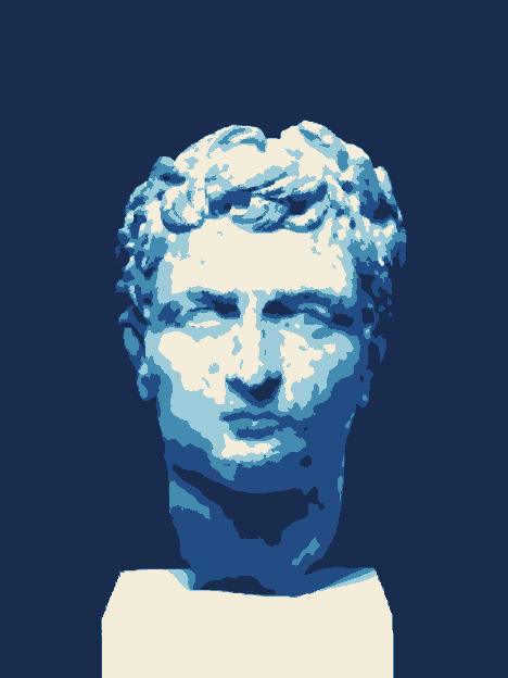
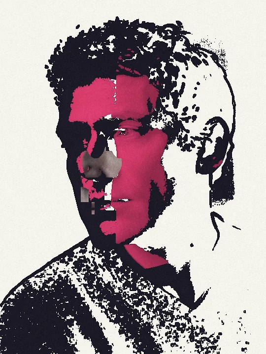
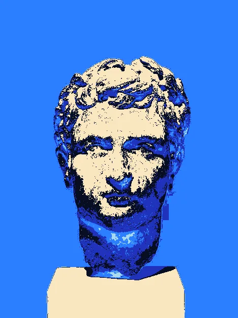
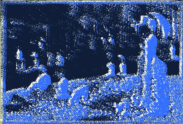
Keep the inks and focal treatment, then fit the tonal bands to each new photo. The tall marble-head photograph below uses the same print direction with a newly fitted focal area and tonal distribution.
Roman marble head · The Met · CC0 ↗Same direction, fitted to a different photograph.
The TRACE reference · Individual techniques
One image. Different decisions.
After trying the starting point above, isolate one decision here. These focused experiments retain the manual brushes, plates and competition controls. Continue with a useful result or return to Start to compose a fresh piece.
The studio asks before applying the setup. Your existing work stays intact until you choose.
01 / TRACE
Divide light into plates
Tonal mode assigns lightness bands to plates. More plates create more intervals; exposure and gamma redistribute the photograph before those intervals are selected.
Try this
Start with two plates. Move the boundary until both the subject and background remain readable, then compare three and five plates.
If it does not read
If one ink takes over, correct exposure or gamma before adding more plates. Strongly lit subjects usually separate more clearly.
Take it further
PNG keeps the combined appearance. SVG preserves the plate geometry for further editing.
Tonal mode separates brightness. Structure mode extracts image features. Detail changes the geometry, while surface chooses whether the raster composite retains photographic texture.
Try this
Compare both extraction modes on the same source. Choose the lowest detail that preserves the important outline.
If it does not read
Too many tiny paths make an SVG harder to use. Start with medium or low detail and a simpler source; inspect the actual SVG before production.
Take it further
For cutting, use Export → Cut files and inspect the original tonal geometry at the intended physical size. Colors edits connected color regions in a separate workspace; its output is not the cutting geometry. An ordinary layered SVG is not automatically a safe cut file.
The Dark plate keeps its original shapes but prints with a solid fill, dots or lines. Scale, angle and mark size belong to that plate; the SVG stores a real vector pattern rather than a screenshot.
Try this
Compare Solid and Dots, then Lines at the same scale. Reduce mark size to let more of the paper show through.
If it does not read
Very fine screens can disappear at small display sizes. Judge the actual SVG and a print proof at the intended size. Cutting files keep the original solid outline.
Take it further
PNG captures the composite. SVG and the Pro plate ZIP retain editable vector patterns. Compose print dots are a separate raster finish.
Load a photo and open Start → Tonal print. The initial five-ink composition fits tonal bands and a focal area to the source.
02 / Judge
Move the focal area onto the detail that matters. Compare Quiet background, Focal priority and Broad / Balanced / Fine detail. Keep the lowest detail that preserves recognition.
03 / Refine
Apply the preview, then use Plates for exact boundaries, ink colors, registration and vector screens. Clean up specks only when they are unwanted. Colors is a separate region-recolouring workflow.
04 / Carry it forward
Save the style. For a series, fit tonal bands and the focal region to each image while keeping the ink family. PNG captures appearance; SVG contains real plate paths. Cut files adds aligned geometry and physical dimensions.
Focal priority is guided regional simplification, not automatic object cutout. Compose finishes and photo texture remain raster treatments; SVG retains geometry, plate inks and vector screens. Inspect physical cutting or printing in the target workflow.