TRACE workshop · 12–20 minutes
An editable two-ink poster.
Develop a readable focal area, then reduce the image to two purposeful inks. Deliver editable paths alongside the finished raster.
Choose example images or your own. The same guide stays within reach in the studio.
Bring the right source.
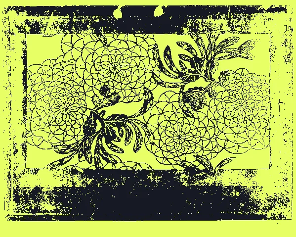
Choose a strongly lit subject. The included Chrysanthemums source is a stencil design from The Met, not a photograph; use your own photo to explore the focal treatment on complex material.
Inspect the sources and credits →Leave with useful files.
A composite PNG, a two-plate SVG and an editable project backup.
You can create and follow the workshop for free. Watermarks, dimensions, animation length and production packages depend on the export option; check the format guide and Free / Pro before planning a delivery.
The work, step by step.
01 / TRACE
Find the shape worth preserving
Load the supplied stencil design or your own photo. Open Start → Tonal print. Place the focal area over the subject, quiet the background and choose the lowest detail that keeps its identity. Apply the preview.
- Check your work
- The subject reads in solid inks before reducing the number of plates.
- If it goes wrong
- A low-contrast subject may merge with its background; move the focal area or choose more distinct lighting.
02 / TRACE
Reduce to two inks
Open Plates. Choose Tonal bands, two plates and Solid inks. Adjust the two-plate boundary, Exposure and Midtones around the focal shape. Compare with the five-ink starting print in History.
- Check your work
- Each ink carries a useful shape, with the defining outline still legible.
- If it goes wrong
- Return to the richer separation if two inks erase the feature the piece needs.
03 / TRACE
Choose the two inks
In Plates, set Light and Dark to contrasting colors. Toggle the plates individually to see exactly what each contributes; restore both before exporting the composite.
- Check your work
- Each ink has a clear role and neighboring shapes remain distinguishable.
- If it goes wrong
- Increase lightness contrast if two attractive colors merge when viewed small.
04 / TRACE
Compare a real alternative
Preserve this version in History, then try a different boundary or ink pair. Compare the alternatives at the same size.
- Check your work
- You can return to the chosen two-ink separation.
- If it goes wrong
- If both versions feel busy, simplify the source or lower detail rather than adding another finish.
05 / TRACE
Separate raster styling from paths
If you use Compose, toggle the passes and decide whether the raster poster needs them. SVG keeps editable shapes and original inks; it does not bake raster finishing into paths.
- Check your work
- You know which appearance belongs to PNG and which belongs to SVG.
- If it goes wrong
- For a matching vector palette, change plate inks directly instead of relying on Duotone in Compose.
06 / TRACE
Export files with different jobs
Download the PNG and SVG, then save a project backup. Inspect the SVG in your intended vector application before print production.
- Check your work
- The SVG contains editable paths and the intended two inks. PNG matches the on-screen composite. Free output limits are shown in Export.
- If it goes wrong
- A layered poster SVG is not automatically ready for a physical cutter. Use the dedicated cutting workflow and test the target machine separately.
Make a second interpretation.
Swap the dark and light inks to test an inverted poster. Keep the same shapes so the color comparison is fair.