A practical guide · TRACE
Find the shapes inside a photograph
A useful layered image starts with a readable subject. TRACE follows differences in light and dark rather than drawing a single line around everything. Start with broad shapes, then add detail only where it makes the picture easier to recognize.
Open TRACECore tools work without an account. Image effects run in your browser.
Watch it in the studio
Silent recordings of the real playground with the sample photo. Each step is labeled with the control's name, so you can follow along in another tab.
Video unavailable. You can still read the written instructions on this page.
Steps in this clip
- Two layers: a bold silhouette
- Five layers: more tonal steps
- Three is a good start
- Detail controls how much structure survives
- Offset moves the plates apart
- Hold Original to compare
Video unavailable. You can still read the written instructions on this page.
Steps in this clip
- Open Plates
- Tonal bands follow the light
- Pick an ink family
- Solid inks show the SVG geometry
- Photo texture for the PNG
Video unavailable. You can still read the written instructions on this page.
Steps in this clip
- Open Settings
- Choose Color topology
- Drag between regions to swap their colors
- Click a region to select it
- Every edit can be undone
TRACE / Start with a composition
The photographer, separated.
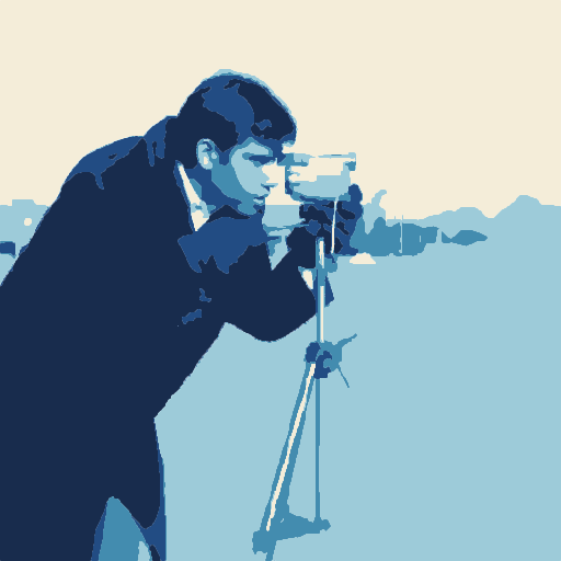
Focal priority keeps the person and camera legible while the background is grouped into broader masses. Five fitted tonal bands preserve the lighting; Solid inks exposes the same geometry delivered in SVG.
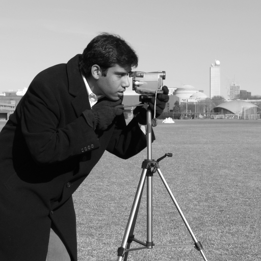
Lav Varshney · CC0 / public domain ↗
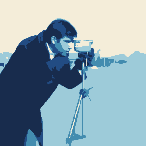
Download PNG ↓ · Editable SVG ↓
Make a decision. Look at the camera silhouette, face and jacket. Keep the lowest detail that preserves them; lower background detail when distant texture competes. A focal region guides simplification, it does not cut out a semantic subject.
Try it. Open Start → Tonal print. Place the focal area around the person and camera; compare Quiet background and Detail before applying. Applying Start is one undoable edit; compare the preview before applying, then keep a version in History.
For your own image, open Start → Load style and choose the downloaded file. Refit the focal area or crops, compare the preview and apply. The example uses an unmarked Pro output; the same creative controls are free.
Compare the earlier techniques
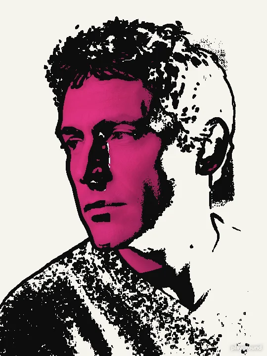
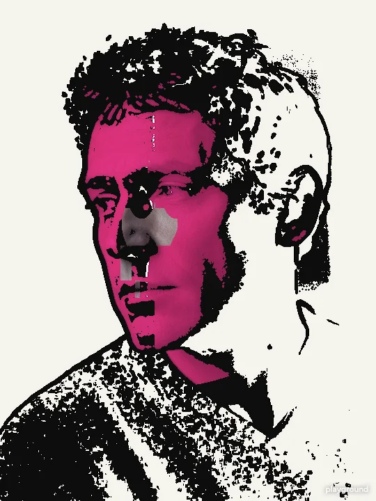
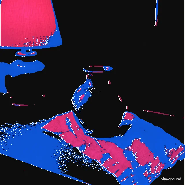
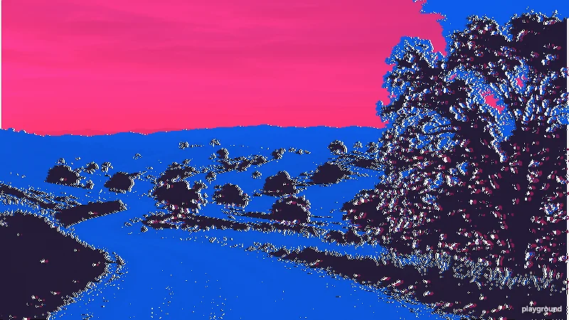
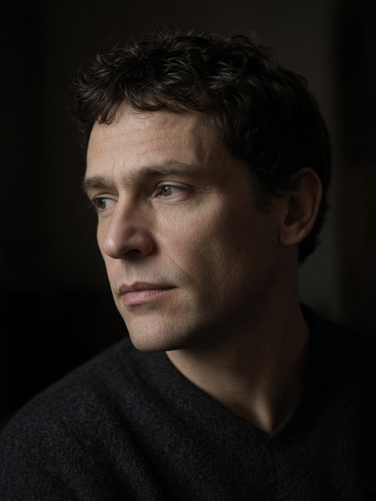
Actual studio exports from generated example images. These isolate layer counts, gestures and competition rules; they are not ordinary camera photographs.
Make it your own
Separate focal detail from background
Open Start → Tonal print. Place the focal region around the subject, turn on Give the focal area priority and adjust Quiet background, then choose Broad, Balanced or Fine detail. Turn off Keep photo texture to inspect the solid colors before applying. This guides simplification; it does not automatically cut out an object.
Look at the source lighting
Pick a portrait, object or landscape with distinct light and shadow. A subject with almost the same brightness as its background may merge with it. Cropping or choosing a clearer source often helps more than adding layers.
Compare two, three and five
Two layers make a bold graphic. Three offer a middle tone for faces and rounded objects. Five preserve more changes in a landscape, with more small shapes to inspect. Switch layer visibility to see what each plate contributes.
Tune, compare and save
Adjust Detail and Offset, hold Original to check recognition, and save a version you like. Export PNG for the textured image or SVG for flat shapes. A backup keeps the original and settings so another experiment does not replace your only copy.
Keep a direction across photographs
Save a style in Start after choosing the treatment and ink family. Load it with another photo and refit the focal area or paired crops before applying. A style holds reusable decisions; a project backup also holds the source images, History and recorded work.
Batch output can fit tonal bands and the focal treatment to each image. Inspect the subject and background on every result, especially when lighting changes. Preserve the ink family rather than forcing identical brightness boundaries onto every source.
Choose detail for the result's actual size
Fine hair, leaves and fabric can create hundreds of small regions. Those regions may be appropriate for a large print and distracting in a small social image. Start at Medium, then compare Low and High at the size people will see. More contours do not automatically make the result better.
Offset deliberately misregisters the plates. A small amount adds separation around edges; a large amount produces displaced color shapes. If you are judging the outline itself, reduce Offset first. Changing the Look changes the inks and background, so compare structure before choosing a finish.
When the result loses the subject
A dark jacket against a dark background may become one large region. Low-contrast fog can flatten into broad bands, while a busy branch pattern can become a field of fragments. These are consequences of tonal separation, not evidence that an export has found semantic objects. Try a tighter crop, a source with stronger lighting or fewer layers.
For the portrait shown here, two layers remove an intermediate tone that the three-layer version retains. For the landscape, five layers expose extra divisions, but they also create more pieces. Use the actual samples to decide which tradeoff suits your image rather than applying one layer count to every subject.
Take the appropriate output forward
The PNG examples preserve photo texture; a flat SVG is easier to edit as shapes. If you want to recolor connected patches of the original photograph, the free Color topology workspace provides region selection and color changes. If you want a physical layered object, use Cut files and inspect isolated pieces, widths and connections. Those tasks use different checks from choosing an attractive art preview.
Questions before you start
Is this a one-line outline filter?
No. TRACE separates tonal areas into plates. The vector output contains closed region boundaries, including holes, rather than a single centerline stroke around the subject.
Why do hidden layers change the picture so much?
A plate can cover a large tonal area. Hiding it removes that contribution to the composite. Turn layers on individually when you want to understand their shapes before exporting.
Will five layers always be more accurate?
Five layers describe more tonal ranges, but they can also produce extra fragments. Choose the count that preserves the features you need at the final viewing or making size.
Can I get back to the starting image?
Hold Original for a temporary comparison. Use History for a saved state and keep a project backup for recovery. A flattened PNG alone does not retain the editable layer settings.